Abracadabra: Goodbye Jobs
Government-paid statisticians quietly just erased 1-in-4 jobs added last year
When it seems too good to be true, it is. The monthly job reports last year overstated growth in nonfarm payrolls by almost 800,000.
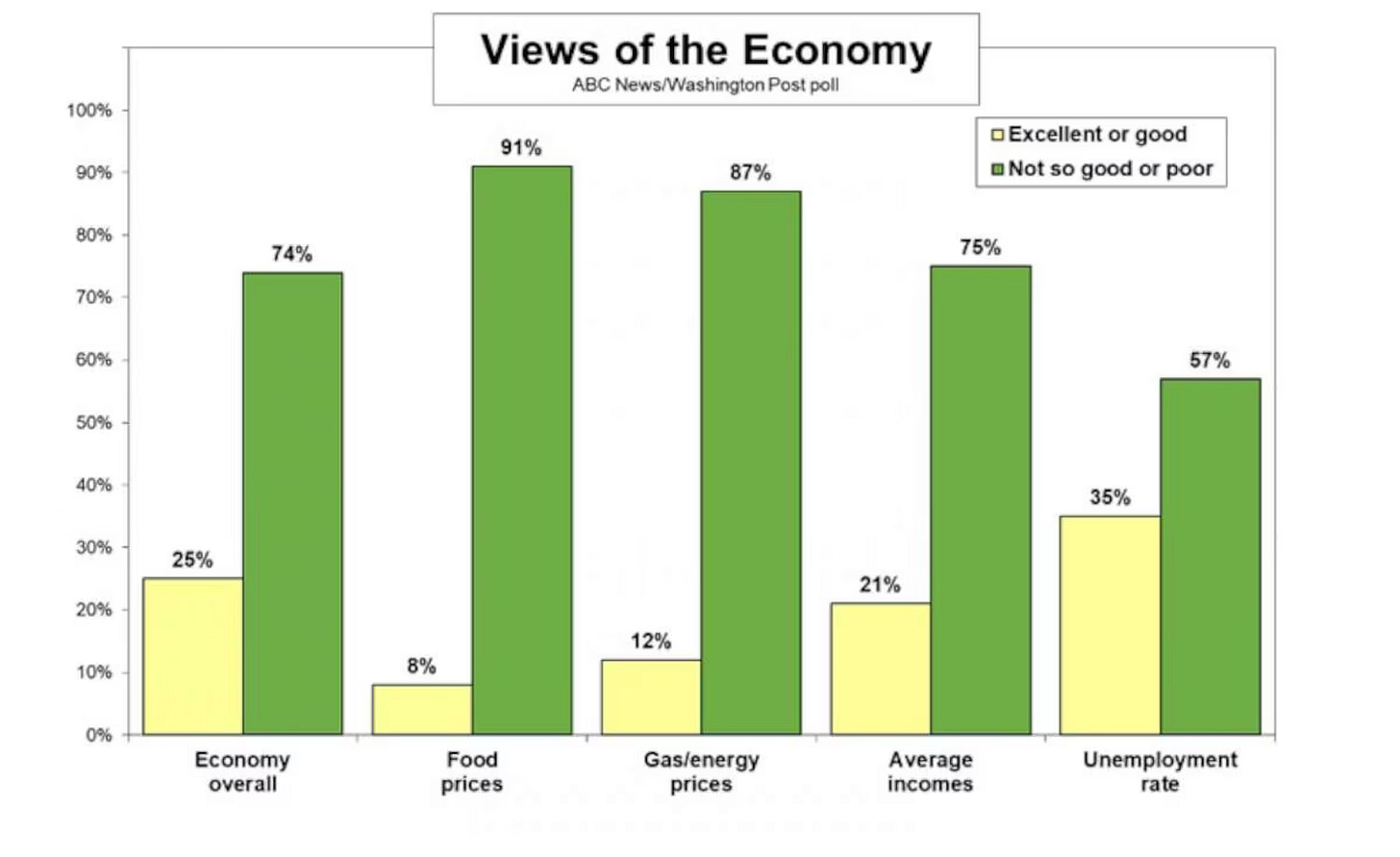
That’s just the latest piece to the puzzle of how headline economic data can supposedly be great and yet polling on the economy is so terrible. And if you think we’re referring to the normal revision process of these reports, think again.
The monthly job numbers are usually revised several times as part of the normal reporting process. As more data come in to the Bureau of Labor Statistics, the nonfarm payroll figure is adjusted in the two reports following the preliminary estimate.
Then, an entire year’s worth of data is revised sometime in the following year. Sometimes new data comes to light which requires revising figures even further back than the prior year.
That’s usually because a problem is discovered with the BLS models. Since the monthly job reports rely on a survey of 666,000 businesses, a lot of assumptions have to be made to extrapolate from that survey how many jobs are in the whole country.
Modeling problems usually aren’t too severe unless the economy changes rapidly, usually because of radical changes to public policy, like the Federal Reserve violently changing interest rates or the Treasury auctioning trillions of dollars in new debt.
In the beginning of the Great Recession, the economy—particularly the labor market—was deteriorating so quickly that BLS couldn’t adjust their models fast enough to keep up. The result was wildly incorrect employment data.
While the BLS was showing steep job losses of 1.9 million for 2008, they were still way off with just how bad the losses were.
That year saw downward revisions of about 900,000—the biggest drop up to that point—which culminated in 2.8 million total job losses for the year.
Fastforward to our post-pandemic world and BLS still hasn’t adequately updated their models that are used for the monthly job reports. Assumptions that were reasonable in 2019 are laughably incorrect today.
That’s why nearly every month last year had its nonfarm payroll numbers revised down. But it just got worse. A lot worse.
BLS just published its quarterly census of employment and wages (QCEW) for the fourth quarter of 2023, and it shows job growth way below what the monthly job reports estimated—and that’s even after the substantial downward revisions.
The QCEW showed annual growth of 1.5 percent, as opposed to the 2.0 percent in the monthly reports. At first blush, that sounds like a literal rounding error, not something to get bent out of shape about, but it’s significant.
In an economy with over 150 million nonfarm payrolls, even a fraction of a percent is a lot of people. In this case, it’s over 770,000.
That’s a lot of jobs to suddenly go up in smoke at the stroke of a bean counter’s pen. Put differently, about a quarter of all the jobs we thought we added last year never existed.
That’s like taking three whole months of job growth and making them disappear - poof, they’re gone.
Long-time readers of our newsletter know that data revisions are a pet peeve of ours, especially when it comes to job numbers. That’s not because we don’t recognize revisions as a normal part of the data collection and dissemination process, but because many BLS models today have become near worthless.
If you’re wondering why we put so much faith in the QCEW while trashing the monthly job estimates, that’s a fair inquiry. Here’s why.
Those monthly reports are derived from survey data that cover a relatively small percentage of American businesses and jobs; a lot of extrapolations are needed to create nationwide estimates.
Conversely, the QCEW is not a survey, but a census. It reaches about 18 times as many businesses as the monthly survey and covers over 95 percent of jobs. Thus, the QCEW data is way more accurate.
It’s even available all the way down to the county level, so analysts can zero in on precisely where there’s job growth—or losses.
That raises another question: if it’s such a better gauge of nonfarm payrolls, why isn’t the QCEW used instead of the monthly survey? It’s partly because of the “Q” in QCEW.
Since the census is only conducted quarterly, the information isn’t as frequent. It’s also not very timely, taking about five months after the close of the quarter to be published. Such is the nature of a census, not a survey.
This is just another reason why it’s so important to take economic data with a grain of salt. Each report needs to be viewed comprehensively. That means not only looking at the report in its entirety but also in the context of all other available data.
The QCEW helps square the circle on why economic polling data can be so terrible, yet the business headlines can be so good. It turns out the headlines were full of garbage because the underlying data was junk.
Telling the public over and over again that their family finances are great doesn’t put food on the table or gas in the tank. It doesn’t keep a roof over your head either.
But just as the monthly revisions typically don’t receive much—if any—attention in the business headlines, the QCEW is nowhere to be found.
It’s pretty Orwellian when you think about it. There might not be a literal memory hole where newspaper clippings are sucked away en route to an actual incinerator, but it’s eerily close.
We’re fast approaching a point where the most accurate economic information will be derived simply by asking a lot of folks how they feel about the economy.
The jobs numbers are unreliable.
The inflation numbers are purposely manipulated down.
The GDP figures are goosed by government deficit spending.
While something as subjective as “feelings” may sound like a terrible gauge in what should be a hard science, what’s the alternative? Using numbers that have been so fudged they look like they were printed by the Chinese Communist Party.
But cooking the books can never change how people feel. Ironically, the political meddling of federal bureaucrats has turned one of the most subjective economic measures into perhaps the best gauge of objective economic reality.
And it looks pretty bad.


